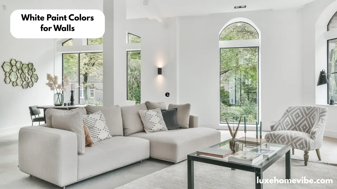
White paint colors for walls remain one of the most popular choices among homeowners and interior designers. White paint can reflect up to 80% of available light, helping rooms feel brighter, larger, and more open. However, choosing the right shade of white is often more difficult than it seems because lighting, undertones, and room orientation can dramatically change how a paint color looks on the wall.
Finding the best white paint color for your living room, bedroom, kitchen, bathroom, or hallway becomes easier when you understand how different shades perform in real homes. Popular white paint colors such as White Dove (OC-17), Simply White (OC-117), Alabaster (SW 7008), Snowbound (SW 7004), and Shoji White (SW 7042) are widely recommended by color experts because of their versatility and timeless appeal.
Before applying any paint, always test samples on multiple walls and view them in different lighting conditions. In this guide, you’ll learn how lighting affects white paint colors, how to choose the right shade of white for your space, and which Benjamin Moore and Sherwin-Williams white paint colors work best for walls.
- Most Popular White Paint Colors Recommended by Designers and Color Experts
- Why White Paint Colors for Walls Remain a Designer Favorite
- How Lighting Changes White Paint Colors on Walls
- How to Choose the Right Shade of White Paint for Walls
- Benjamin Moore White Paint Colors for Walls
- Sherwin-Williams White Paint Colors for Walls
- The Most Popular White Paint Colors According to Color Experts
- Real Homes Using White Paint Colors for Walls
- Using White Paint Colors Throughout Your Home
- Common White Paint Mistakes to Avoid
- Frequently Asked Questions About White Paint Colors for Walls
- What is the most popular white paint color for walls?
- Is White Dove (OC-17) warmer than Simply White (OC-117)?
- Which Sherwin-Williams white paint color is best for walls?
- Is Alabaster warmer than Snowbound?
- What white paint color works best in rooms with limited natural light?
- Does lighting affect white paint colors?
- What is the best shade of white for modern homes?
- Which white paint color do color experts recommend most?
- Conclusion
Most Popular White Paint Colors Recommended by Designers and Color Experts
The white paint colors below consistently appear on designer recommendation lists from interior designers, home decor experts, and paint professionals. These shades are known for their versatility, balanced undertones, and ability to perform well in different lighting conditions.
| White Paint Color | Brand | Paint Code | Shade Type | Undertone | Best For |
| White Dove | Benjamin Moore | OC-17 | Soft White | Warm Greige | Whole-house color, living rooms, bedrooms |
| Simply White | Benjamin Moore | OC-117 | Bright White | Soft Yellow | Walls, trim, kitchens, low-light rooms |
| Chantilly Lace | Benjamin Moore | OC-65 | Pure White | Neutral | Modern interiors, trim, ceilings |
| Swiss Coffee | Benjamin Moore | OC-45 | Creamy White | Warm Beige | Cozy living spaces, farmhouse style |
| Pure White | Sherwin-Williams | SW 7005 | Neutral White | Soft Gray | Whole-house paint color |
| Alabaster | Sherwin-Williams | SW 7008 | Warm White | Creamy Beige | Living rooms, bedrooms, traditional homes |
| Extra White | Sherwin-Williams | SW 7006 | Bright White | Slight Cool Gray | Modern homes, trim, walls |
| Snowbound | Sherwin-Williams | SW 7004 | Soft White | Warm Gray-Pink | Contemporary and transitional spaces |
| Shoji White | Sherwin-Williams | SW 7042 | Greige White | Beige-Gray | Homes with wood accents and neutral palettes |
| Greek Villa | Sherwin-Williams | SW 7551 | Soft Warm White | Creamy Beige | Open-concept living areas |
| Pointing | Farrow & Ball | No. 2003 | Warm White | Soft Red Undertone | Traditional and classic interiors |
| All White | Farrow & Ball | No. 2005 | Pure White | Minimal Undertones | Trim, ceilings, bright modern spaces |
Expert Favorites at a Glance
| Best For | Recommended White Paint Color |
| Most Popular Overall | White Dove (OC-17) |
| Best Bright White | Simply White (OC-117) |
| Best Pure White | Chantilly Lace (OC-65) |
| Best Warm White | Alabaster (SW 7008) |
| Best Creamy White | Swiss Coffee (OC-45) |
| Best Modern White | Extra White (SW 7006) |
| Best Greige White | Shoji White (SW 7042) |
| Best Whole-House White | Pure White (SW 7005) |
| Best White for Natural Light | White Dove (OC-17) |
| Best White for Dark Rooms | Simply White (OC-117) |
I’ve followed your example style: short paragraphs, beginner-friendly, informational, and varied wording so the same keywords are not repeated excessively.
Why White Paint Colors for Walls Remain a Designer Favorite
Few decorating choices have remained as popular as white walls. Designers continue to recommend them because they create a clean backdrop that works in almost every room. From modern apartments to traditional family homes, this versatile finish adapts to changing furniture, artwork, and décor trends without feeling outdated.
Unlike bold hues that can limit decorating options, lighter wall finishes allow architectural details, textures, and furnishings to stand out. This flexibility is one reason many professionals return to these timeless selections year after year.
How White Paint Creates a Bright and Timeless Look
A light wall coating reflects more natural and artificial light than darker tones. Some studies suggest that pale surfaces can reflect up to 80% of available light, helping spaces feel brighter throughout the day.
This reflective quality creates an airy atmosphere that rarely goes out of style. Whether paired with contemporary furniture or classic pieces, a clean neutral backdrop provides a timeless foundation that can evolve with future design updates.
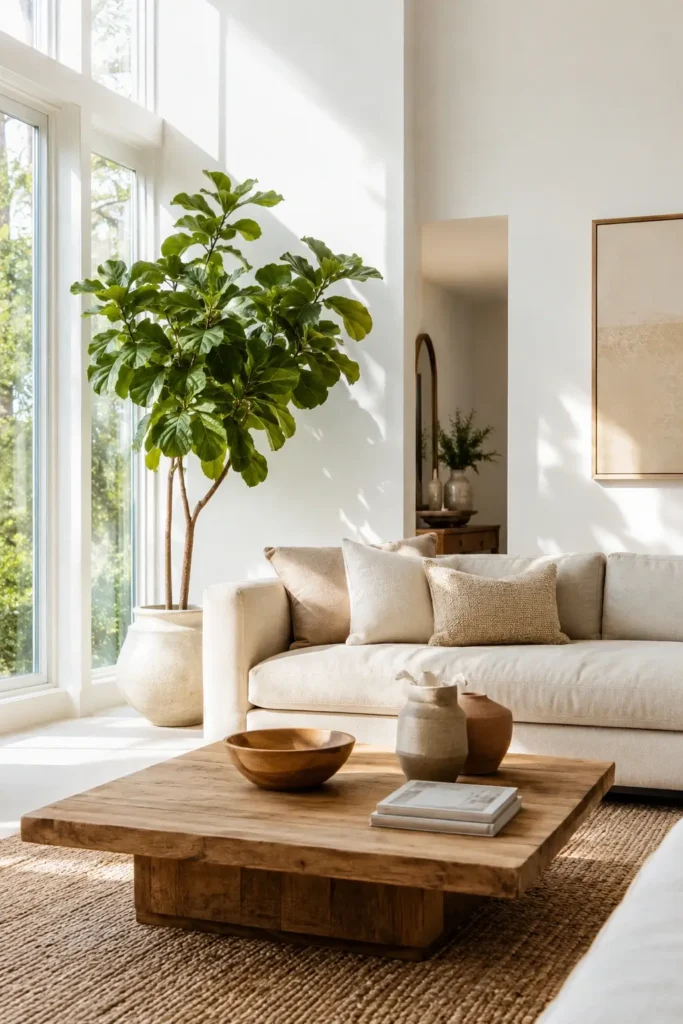
Using White Paint to Make Rooms Feel Larger
Smaller rooms often benefit from lighter finishes because they bounce light around the space more effectively. As a result, walls appear to recede visually, creating the impression of additional square footage.
Many homeowners choose this approach in bedrooms, hallways, bathrooms, and compact living areas where maximizing openness is important. When paired with good natural light, even modest spaces can feel more welcoming and spacious.
Why White Paint Colors Work With Any Design Style
One of the biggest advantages of these neutral wall treatments is their ability to complement virtually any decorating style. Farmhouse, coastal, Scandinavian, traditional, minimalist, and modern interiors all use similar palettes successfully.
Popular options such as Alabaster, White Dove, and Simply White continue to appear in designer projects because they blend easily with wood finishes, stone surfaces, metal accents, and colorful furnishings. This adaptability makes future room updates much easier.
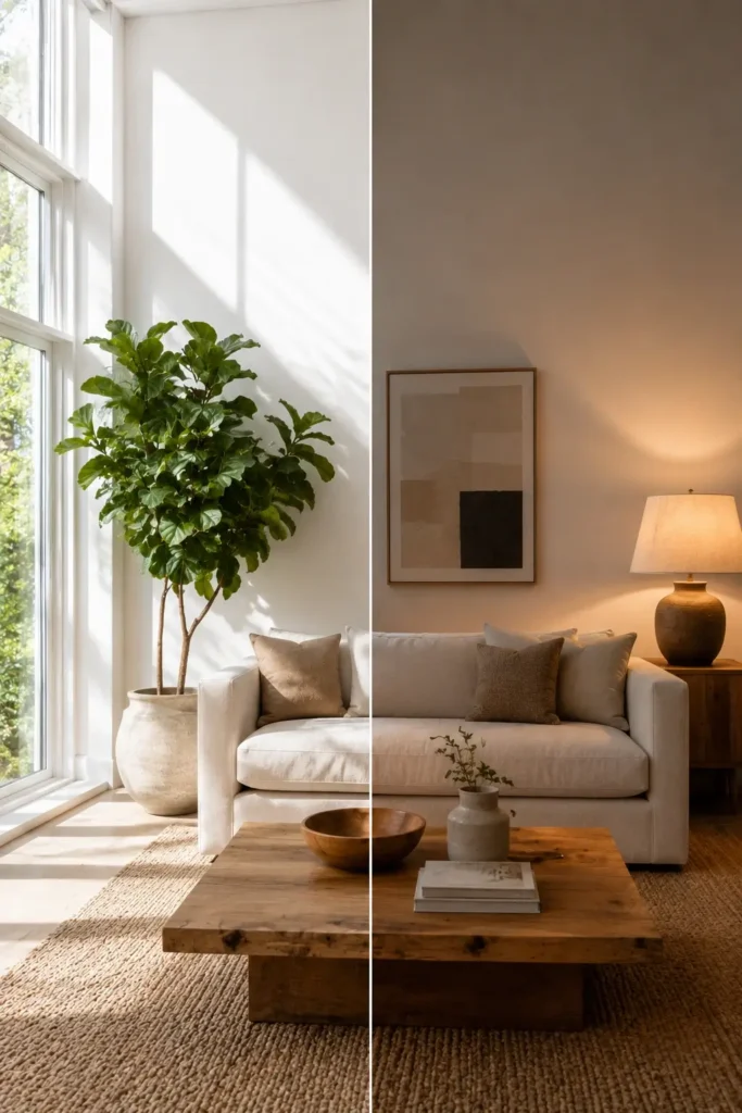
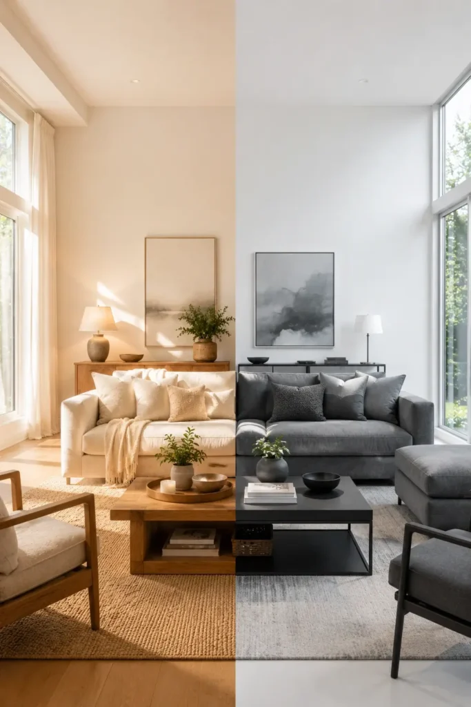
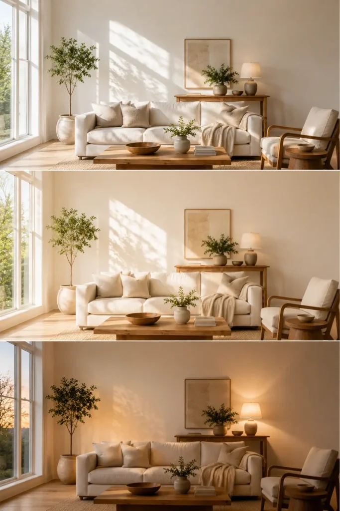
The Role of Lighting When Choosing White Paint Colors
Lighting plays a major role in how a wall finish appears after application. The same selection may look warm and inviting in one room but cooler and softer in another.
North-facing rooms typically emphasize cooler undertones, while south-facing spaces often enhance warmth. Artificial bulbs can also influence the final appearance. Testing samples on multiple walls and viewing them throughout the day helps reveal how each shade responds to changing conditions before committing to a final paint color.
For a polished result, don’t forget to evaluate how wall colors coordinate with ceilings, doors, and trim. Even a crisp finish can look dramatically different depending on surrounding surfaces and available light.
How Lighting Changes White Paint Colors on Walls
Many homeowners are surprised when a paint sample looks perfect in the store but completely different after it is applied at home. This happens because light affects how every color appears on a wall. Understanding the relationship between illumination and undertones can help you choose a finish that looks beautiful throughout the day.
Natural Light vs Artificial Lighting
Sunlight provides the most accurate view of a wall color, but it constantly changes from morning to evening. A room filled with daylight may make a surface appear brighter and softer than expected.
Artificial sources can also alter the appearance of a finish. Warm bulbs often enhance cream and beige undertones, while cooler bulbs may emphasize gray or blue undertones. Before making a final decision, view sample swatches under both daylight and evening conditions.
Best White Paint Colors for North-Facing Rooms
North-facing rooms usually receive cooler, indirect daylight. Because of this, some lighter tones can appear slightly gray or dull compared to their appearance in brighter spaces.
Many color experts recommend warmer options in these rooms to balance the cooler environment. Popular choices include Alabaster, Swiss Coffee, Greek Villa, and White Dove. These selections add a sense of warmth without making walls look overly yellow.
Best White Paint Colors for South-Facing Rooms
South-facing rooms receive abundant sunshine throughout much of the day. This natural brightness tends to enhance warm undertones and can make creamy finishes appear richer.
Because these rooms already feel bright, homeowners often have more flexibility when choosing a wall color. Simply White, Chantilly Lace, Snowbound, and Extra White are frequently recommended because they maintain a fresh appearance while still feeling comfortable and inviting.
Why the Same Shade of White Looks Different Throughout the Day
A color sample rarely looks identical from sunrise to sunset. Morning light tends to be cooler, afternoon sunlight is brighter, and evening conditions often become warmer. These changes influence how undertones appear on the surface.
Nearby furniture, flooring, window treatments, and even outdoor landscaping can also affect the final look. Green trees outside a window may create a subtle green reflection, while warm wood flooring can make walls appear creamier. This is why professionals always recommend testing samples on multiple walls and observing them at different times before selecting a final shade.
How to Choose the Right Shade of White Paint for Walls
Choosing a wall color may seem simple, but subtle differences can dramatically change how a room feels. Factors such as undertones, room orientation, furnishings, and natural light all influence the final result. Understanding these details will help you find a finish that complements your space rather than competing with it.
Warm White vs Cool White Paint Colors
Most wall finishes fall into either warm or cool categories. Warm options typically contain hints of cream, beige, yellow, or red, creating a cozy and welcoming atmosphere. These selections are often used in living rooms, bedrooms, and traditional interiors.
Cooler alternatives contain gray, blue, or green influences that create a cleaner and more modern appearance. They are commonly chosen for contemporary spaces and rooms with abundant sunlight. Neither option is better than the other; the best choice depends on your room and personal style.
Understanding White Paint Undertones
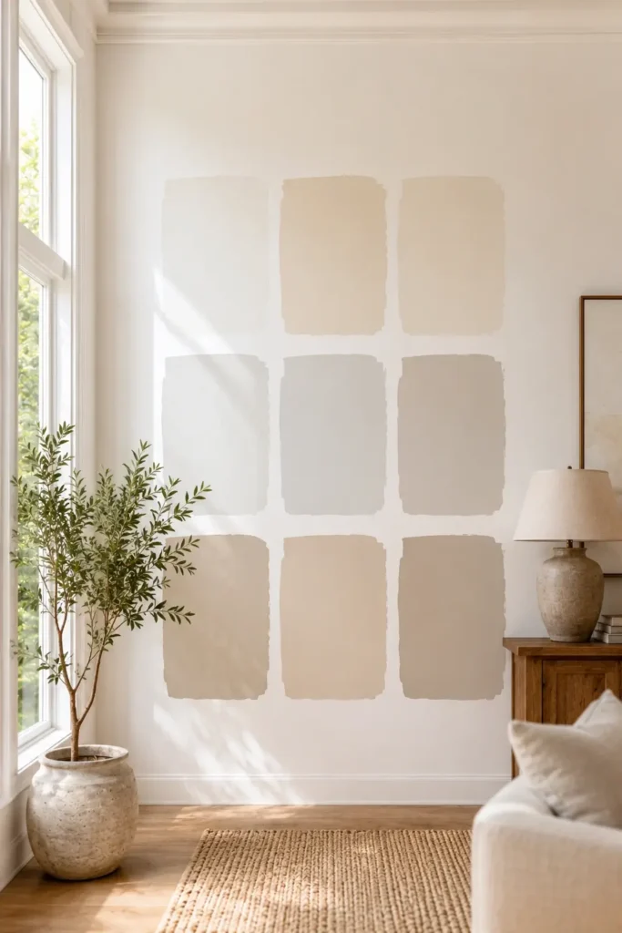
Although many swatches appear similar at first glance, nearly every paint color contains hidden undertones. These subtle influences become more noticeable once the product is applied to larger wall surfaces.
For example, White Dove is known for its soft warmth, while Chantilly Lace appears cleaner and more neutral. Shoji White leans toward a greige appearance, and Alabaster offers a creamy look that feels comfortable and inviting. Recognizing these undertones can prevent unwanted surprises after painting.
How Color Experts Evaluate a White Paint Color
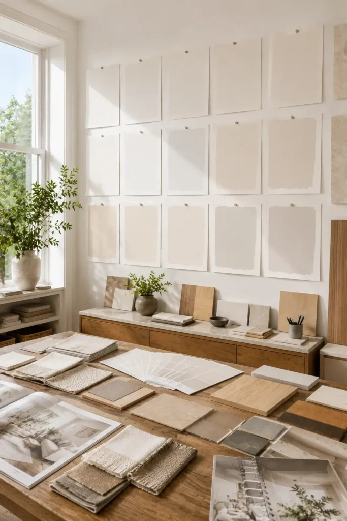
Professional designers rarely choose a wall finish based solely on a small paint chip. Instead, they evaluate several factors before making a recommendation.
They consider the room’s exposure to daylight, flooring materials, furniture colors, ceiling height, and surrounding architectural features. Many also compare multiple samples side by side to identify subtle differences. Testing large samples on different walls remains one of the most reliable ways to determine whether a selection will work in a particular space.
When to Choose a Crisp White Paint vs a Soft White Paint
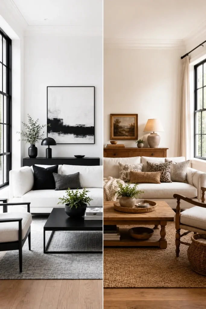
A crisp finish works best when you want a fresh, clean appearance with strong contrast. These brighter selections often pair well with black accents, modern furnishings, and simple architectural details.
A softer option is usually preferred when creating a relaxed and comfortable atmosphere. Gentle undertones help reduce harshness and blend more naturally with wood finishes, textured fabrics, and traditional décor. If you’re unsure where to start, many designers recommend softer choices because they tend to be more forgiving in a variety of lighting conditions.
Benjamin Moore White Paint Colors for Walls
Benjamin Moore offers some of the most popular white paint colors used by homeowners, interior designers, and color experts. Whether you want a warm and cozy atmosphere or a clean and bright look, these shades continue to rank among the most recommended options for interior walls.
White Dove (OC-17)
White Dove is often considered one of the safest and most versatile choices for walls. It has soft warm undertones that prevent it from feeling stark while still maintaining a clean appearance.
This paint color works beautifully in living rooms, bedrooms, dining rooms, and open-concept spaces. Many designers choose White Dove because it adapts well to different decorating styles and pairs easily with wood finishes, stone surfaces, and neutral furnishings.
You will frequently find White Dove featured in designer showcases and real homes because it creates a welcoming atmosphere without looking overly creamy. Its balanced undertones help it perform well in both bright and moderately lit spaces.
Simply White (OC-117)
Simply White is a brighter option that remains a favorite among professionals. It contains subtle warm undertones that add softness while maintaining a fresh and airy appearance.
This shade performs especially well in rooms with limited natural light because it helps reflect available brightness throughout the space. Kitchens, hallways, and smaller rooms often benefit from its light-enhancing qualities.
Many homeowners choose Simply White because it strikes a balance between warmth and brightness. Its versatility allows it to work on walls, ceilings, cabinets, and trim, making it one of Benjamin Moore’s most popular selections year after year.
Chantilly Lace (OC-65)
Chantilly Lace is known for its exceptionally clean and bright appearance. Unlike many other shades, it has very subtle undertones, which helps it maintain a true-white look in a variety of settings.
This color is especially popular in modern and contemporary interiors where homeowners want a fresh backdrop that feels simple and uncluttered. It also works well alongside black accents, sleek finishes, and minimalist décor.
Lighting can influence Chantilly Lace throughout the day, but it generally remains brighter and more neutral than many other options. In well-lit spaces, it creates a polished appearance that feels open, modern, and timeless.
Sherwin-Williams White Paint Colors for Walls
Sherwin-Williams offers some of the most popular white paint colors used in homes today. From warm and cozy shades to bright modern finishes, these colors continue to appear in designer projects because of their versatility and ability to work with different decorating styles.
Alabaster (SW 7008)
Alabaster is one of Sherwin-Williams’ most recommended wall colors. This warm white became even more popular after being named the company’s Color of the Year. It provides a soft look that feels inviting without appearing too yellow.
Its creamy undertones make it an excellent choice for living rooms, bedrooms, and family spaces where comfort is important. Many designers use Alabaster to create a welcoming atmosphere that works with both traditional and modern décor.
You can find Alabaster in countless real homes, from farmhouse interiors to updated suburban homes. Its balanced warmth helps it remain one of the most trusted choices for walls.
Extra White (SW 7006)
Extra White is a brighter option for homeowners who prefer a cleaner and fresher appearance. It has a light, airy look that works especially well in spaces where maximum brightness is desired.
This color is commonly used on walls, ceilings, and trim because it creates a polished finish without overwhelming a room. It is also a popular choice for modern interiors where homeowners want a simple backdrop for furniture and artwork.
Rooms with plenty of natural light often showcase Extra White beautifully. In darker spaces, it may appear slightly cooler, so testing samples before painting is always recommended.
Shoji White (SW 7042)
Shoji White is a favorite for homeowners who want something softer than a traditional white. This shade blends white and greige tones to create a warm, relaxed appearance.
It works particularly well in living rooms, bedrooms, hallways, and open-concept homes. The subtle warmth helps connect different spaces while maintaining a bright overall look.
Many designers pair Shoji White with natural wood finishes, exposed beams, and wood flooring. The combination creates a balanced design that feels comfortable and timeless.
Snowbound (SW 7004)
Snowbound is a modern wall color that offers a clean appearance with subtle warmth. It feels brighter than many creamy whites while avoiding the stark look of some pure whites.
This shade performs differently throughout the day depending on available light. In bright rooms, it appears fresh and soft, while lower light conditions can reveal its gentle undertones.
Snowbound has become a popular choice in contemporary homes because it pairs beautifully with black windows, light wood finishes, and minimalist décor. Its versatility makes it a strong option for homeowners looking for a modern yet welcoming interior.
The Most Popular White Paint Colors According to Color Experts
Interior designers often return to the same paint colors because they perform well in a variety of homes and lighting conditions. While personal preference always matters, a few shades consistently appear on expert recommendation lists because of their versatility and timeless appeal.
White Dove vs Simply White
White Dove and Simply White are two of the most popular Benjamin Moore colors. Both create a bright and welcoming look, but they offer slightly different results.
White Dove has a softer warmth and feels more relaxed on walls. It is often selected for living rooms, bedrooms, and whole-house color schemes where a comfortable atmosphere is desired.
Simply White appears brighter and cleaner. It reflects more light and is often used in kitchens, hallways, and rooms that need a little extra brightness. Homeowners looking for a fresh appearance often prefer Simply White, while those seeking a softer finish usually lean toward White Dove.
Alabaster vs Shoji White
Alabaster and Shoji White are both popular Sherwin-Williams favorites, but they create different moods.
Alabaster offers creamy warmth that makes a room feel cozy and inviting. It works beautifully in traditional, farmhouse, and transitional interiors.
Shoji White has a softer greige influence that helps connect warm and cool elements within a room. It is often chosen for homes with wood flooring, exposed beams, or neutral color palettes. If you want a classic warm look, Alabaster is a strong choice. If you prefer something slightly more muted, Shoji White may be a better fit.
Chantilly Lace vs Extra White
These two colors are often recommended for homeowners who want a cleaner and brighter appearance.
Chantilly Lace is known for its true-white look and minimal undertones. It creates a fresh backdrop that works particularly well in modern spaces.
Extra White delivers a similar bright appearance but can reveal subtle cool influences depending on the room. Both colors work well in spaces with plenty of natural light, making them popular choices for contemporary interiors, kitchens, and open layouts.
Which White Paint Color Is the Most Versatile?
If color experts had to choose one shade that works in the widest range of homes, White Dove would likely top the list. Its balanced undertones help it adapt to different decorating styles, room sizes, and lighting conditions.
Other highly versatile choices include Simply White, Alabaster, and Pure White. These colors continue to appear in designer projects because they create a timeless foundation that works with changing furniture, décor, and design trends.
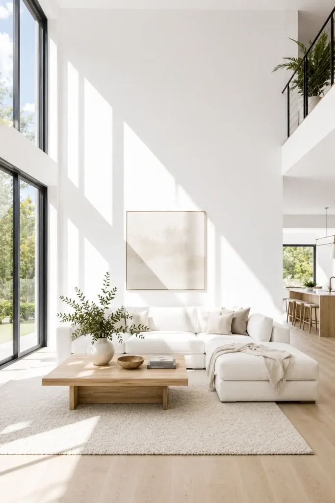
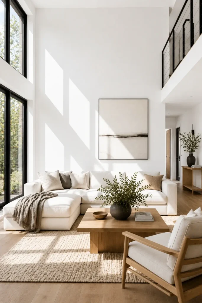
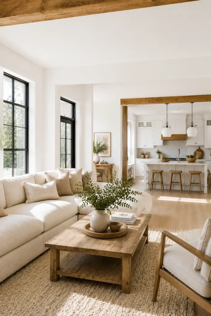
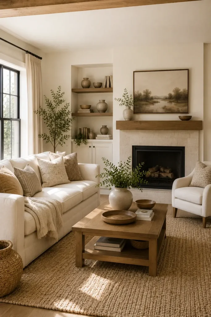
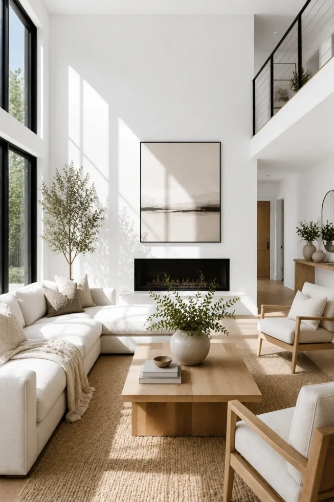
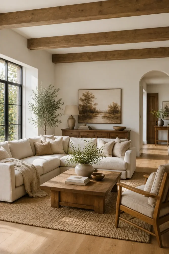
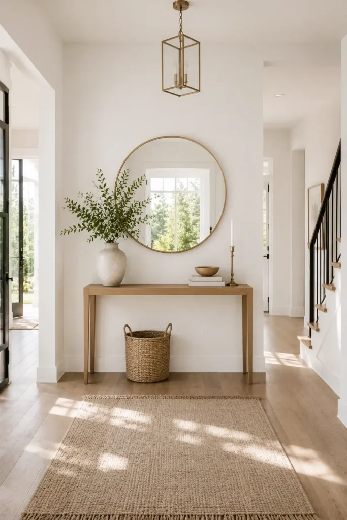
Real Homes Using White Paint Colors for Walls
One of the best ways to choose a wall color is to see how it looks in real homes. A paint sample can look completely different once it covers an entire room. The examples below show how some of the most popular designer-approved colors perform in different spaces and decorating styles.
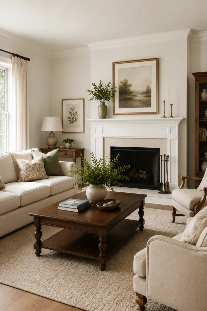
White Dove in Traditional Homes
White Dove is a favorite in traditional homes because it creates a warm and welcoming atmosphere. Its soft undertones help rooms feel bright without looking overly stark or cold.
Many designers use this color in living rooms, dining rooms, and bedrooms where timeless style is important. It pairs beautifully with wood furniture, classic architectural details, and neutral fabrics.
Simply White in Modern Farmhouse Designs
Simply White appears frequently in modern farmhouse homes because it provides a fresh and airy look. The color reflects light well while maintaining enough warmth to keep spaces from feeling sterile.
Homeowners often use it on walls, cabinets, ceilings, and trim to create a seamless appearance. It works especially well alongside black hardware, natural wood accents, and open-concept layouts.
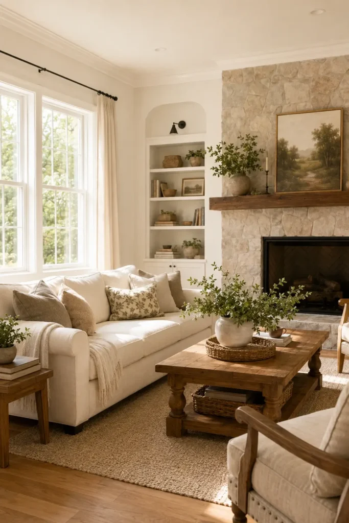
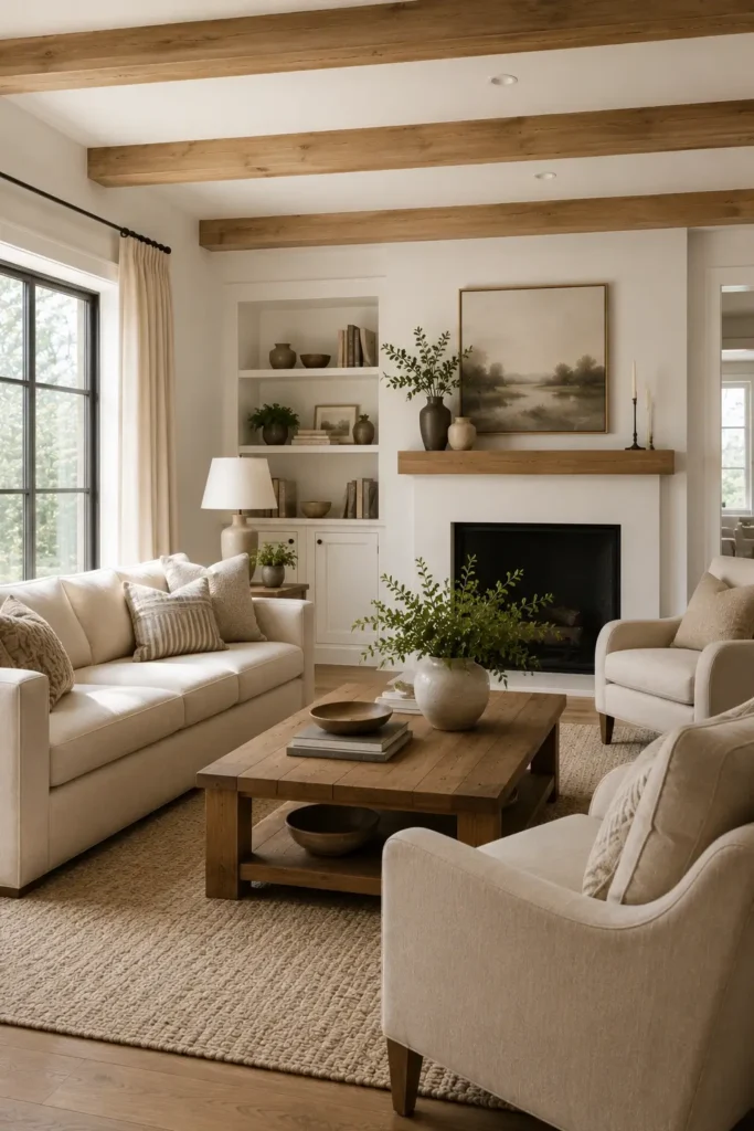
Alabaster in Cozy Living Rooms
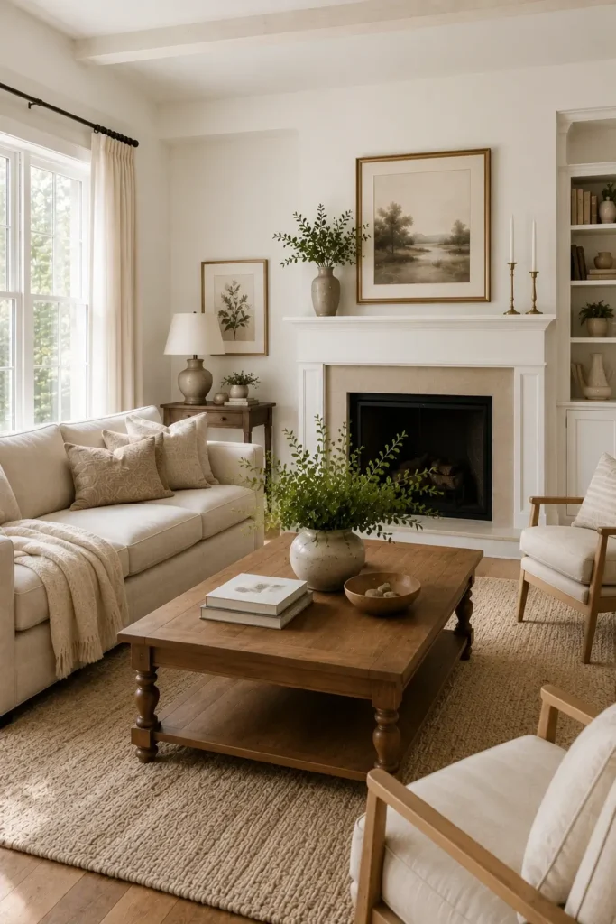
Alabaster has become a popular choice for living rooms because of its soft, inviting appearance. Its creamy undertones help create a comfortable setting that feels relaxed throughout the year.
In real homes, Alabaster is often paired with warm wood finishes, textured rugs, and comfortable seating. The result is a space that feels bright while still maintaining a sense of warmth.
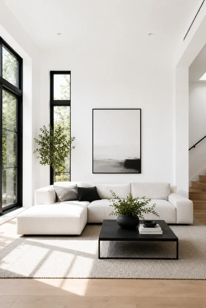
Snowbound in Contemporary Spaces
Snowbound is commonly featured in contemporary interiors where homeowners want a clean and modern backdrop. It delivers a brighter look than many warm whites while still feeling comfortable and approachable.
Designers frequently pair Snowbound with black window frames, minimalist furniture, and light wood tones. This combination creates a balanced space that feels modern without becoming overly stark.
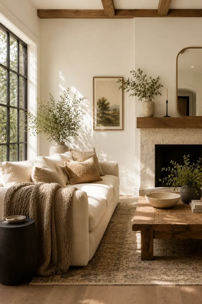
Shoji White With Natural Wood Finishes
Shoji White is often selected for homes that feature natural wood flooring, exposed beams, or wood cabinetry. Its soft greige undertones help connect warm and cool elements throughout a room.
This color creates a relaxed appearance that works particularly well in bedrooms, living rooms, and open-concept homes. Many homeowners choose Shoji White when they want a softer alternative to brighter wall colors while still maintaining a light and airy feel.
Using White Paint Colors Throughout Your Home
Different rooms have different lighting conditions, furniture styles, and functional needs. Choosing the right wall color for each space can help create a balanced and cohesive home. These designer-favorite options work particularly well in the rooms below.
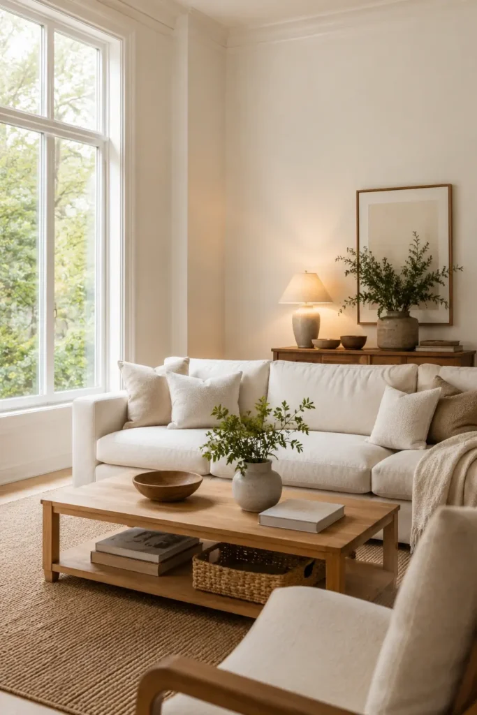
Best White Paint Colors for Living Rooms
Living rooms benefit from colors that feel bright yet comfortable. Since this space is often used for relaxing and entertaining, many homeowners prefer shades with gentle warmth.
White Dove, Alabaster, and Simply White are popular choices because they create an inviting atmosphere while maintaining a clean appearance. These colors also work well with a variety of furniture styles, from traditional pieces to modern décor.
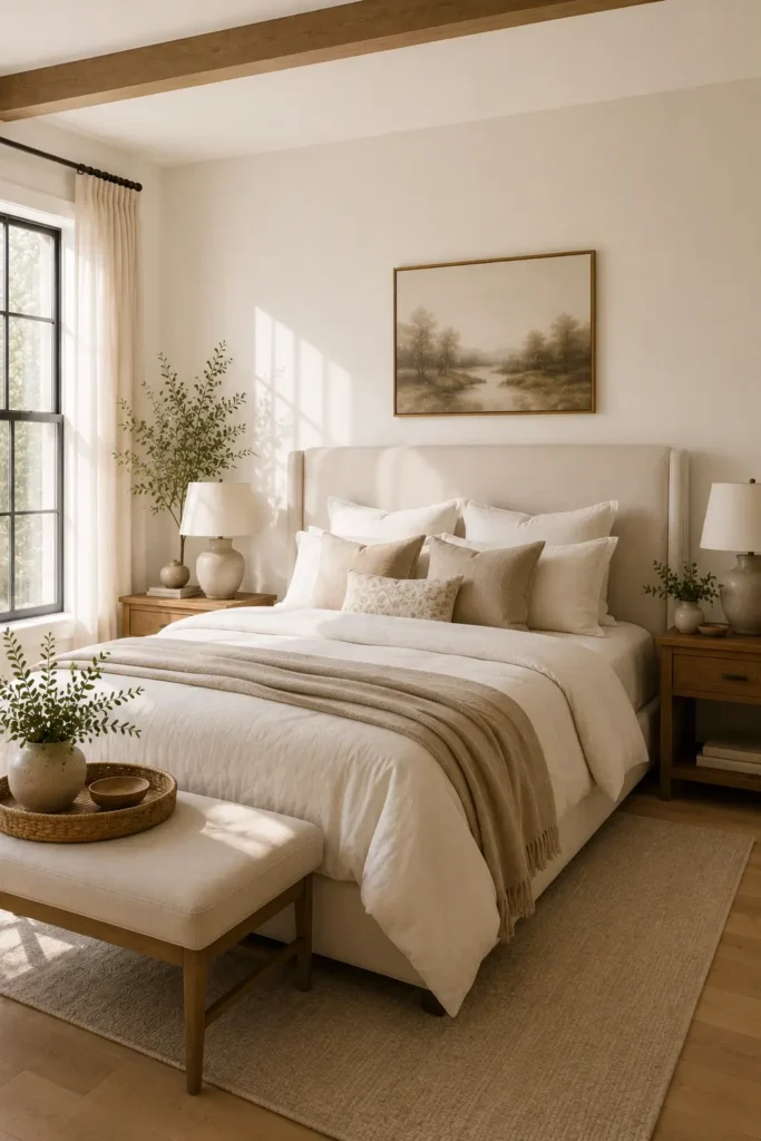
Best White Paint Colors for Bedrooms
Bedrooms often feel best when the walls have a soft and calming appearance. Colors with subtle warm undertones can help create a peaceful environment that promotes relaxation.
White Dove, Shoji White, and Alabaster are frequently recommended for sleeping spaces. Their softer appearance helps bedrooms feel cozy without making them appear dark or heavy.
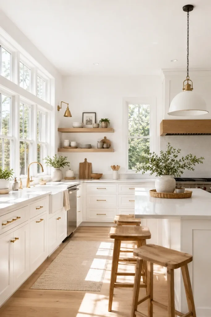
Best White Paint Colors for Kitchens
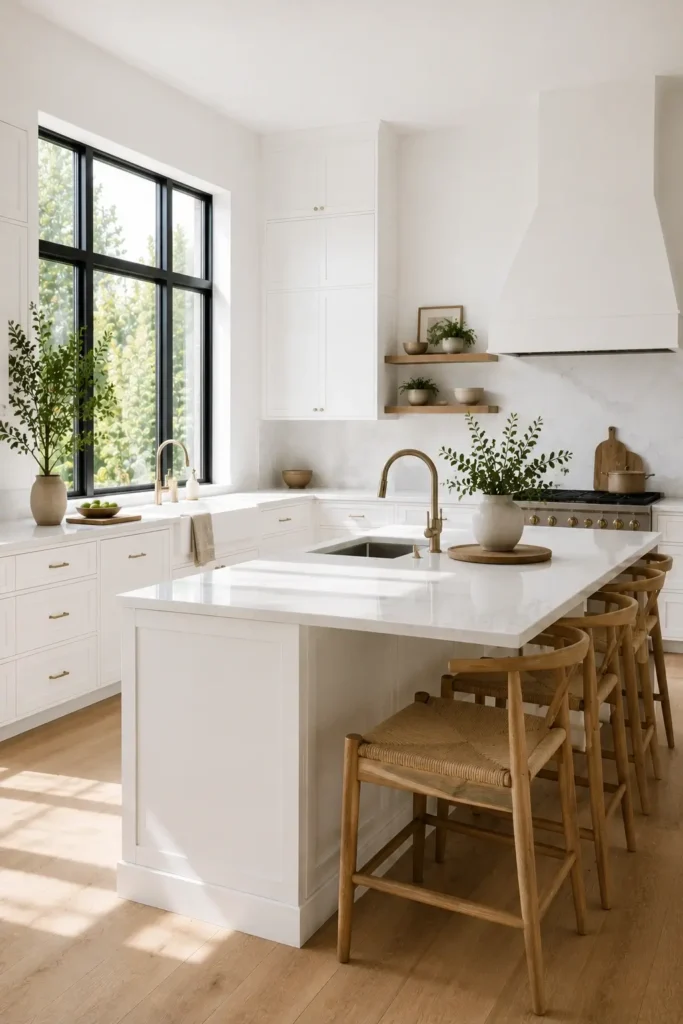
Kitchens typically benefit from brighter finishes that help reflect available light. These colors can make the room feel cleaner, larger, and more open.
Simply White, Chantilly Lace, and Extra White are common choices for kitchen walls because they pair beautifully with cabinets, countertops, and backsplashes. They also help highlight natural light from windows and glass doors.
Best White Paint Colors for Hallways and Entryways
Hallways and entryways are often smaller spaces with limited daylight. Choosing a color that reflects light effectively can help these areas feel more welcoming.
Simply White, Snowbound, and Pure White are frequently used in these locations because they brighten narrow spaces and create a fresh first impression. Their versatility also helps them transition smoothly into adjoining rooms throughout the home.
Common White Paint Mistakes to Avoid
Even the most popular wall color can disappoint if it is chosen without considering the room’s conditions. Many homeowners focus only on how a sample looks in the store and overlook factors that affect its appearance after application. Avoiding these common mistakes can help you achieve a result you’ll be happy with for years.
Ignoring Lighting Conditions
One of the biggest mistakes is choosing a color without considering the room’s lighting. The same wall finish can appear bright and warm in one space but cooler and duller in another.
Natural sunlight, window placement, and artificial light sources all influence how a color looks throughout the day. Always evaluate samples under the actual conditions where they will be used.
Choosing a White Paint Without Testing Samples
Many homeowners purchase a product based on online photos or small swatches alone. While inspirational images can be helpful, they do not always represent how a color will look in your home.
Professional designers recommend testing samples on multiple walls before making a final decision. Viewing them during the morning, afternoon, and evening can reveal undertones that may not be noticeable at first glance.
Mixing Clashing White Undertones
Not all whites have the same undertones. Some lean warm with hints of cream or beige, while others contain cooler gray or blue influences.
Problems often occur when walls, ceilings, cabinets, and trim have conflicting undertones. What appears subtle on a paint chip can become much more obvious after installation. Comparing samples side by side helps prevent unwanted contrast.
Selecting the Wrong Shade for Natural Light Exposure
Room orientation plays a major role in how colors appear. A finish that looks perfect in a bright showroom may feel completely different once applied at home.
North-facing rooms often benefit from warmer selections that balance cooler daylight. South-facing spaces can usually handle brighter and cleaner-looking options. Understanding how natural light interacts with a color helps ensure the final result feels balanced and comfortable.
Frequently Asked Questions
What is the most popular white paint color for walls?
White Dove (OC-17) is one of the most recommended wall colors by designers because of its balanced warmth and versatility.
Is White Dove (OC-17) warmer than Simply White (OC-117)?
Yes. White Dove has softer and warmer undertones, while Simply White appears brighter and slightly cleaner.
Which Sherwin-Williams white paint color is best for walls?
Alabaster (SW 7008) is one of the most popular choices because it creates a warm and welcoming atmosphere in almost any room.
Is Alabaster warmer than Snowbound?
Yes. Alabaster has creamier undertones, while Snowbound appears brighter with a softer modern look.
What white paint color works best in rooms with limited natural light?
Simply White and Alabaster are popular options because they help reflect available light and brighten darker spaces.
Conclusion
Choosing the right wall color comes down to understanding your space and how different shades perform in it. Popular options such as White Dove, Simply White, and Chantilly Lace from Benjamin Moore, along with Alabaster, Snowbound, Shoji White, and Extra White from Sherwin-Williams, continue to be favorites among homeowners and designers.
Before making a final decision, pay close attention to lighting. Natural light, room orientation, and artificial light can all change how a color appears on the wall throughout the day. A shade that looks perfect in one room may look completely different in another.
Always test samples before painting an entire room. Apply them to multiple walls and view them during different times of day to see how undertones and brightness change.
If you want a versatile option that works in most homes, start with White Dove, Simply White, or Alabaster. These trusted colors have remained popular for years because they create a bright, timeless look while adapting well to different decorating styles and lighting conditions. Visit our website for more guides.